Brochure catalogue design reference [4]
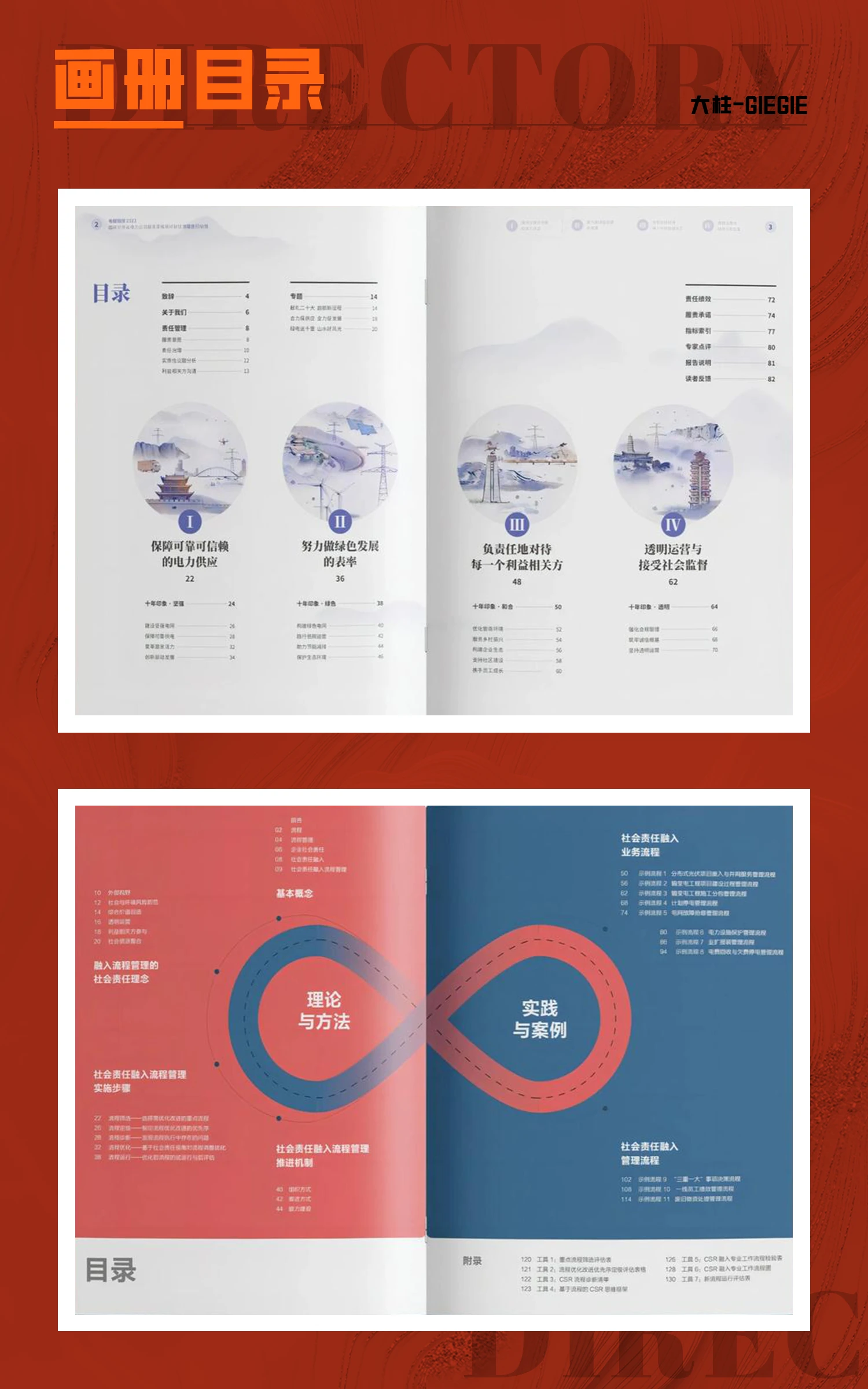
The catalogue plays the function of retrieving the content of the whole album design, which can reflect the framework and design style of the whole album. The design of the catalogue needs to serve the theme of the album, can be seen at a glance, different themes choose different colours and styles.
In the normal layout of the album is usually divided into two parts, but in order to highlight the content, so that the unfolding of the content in the visual impact, we usually cross-page design, so that the picture from one page to two pages to enlarge.
The presence of numbers in the design of the catalogue page is particularly important, not only as a guide and summary of the contents of the catalogue, but also in the overall visual design, the use of numbers can enrich the visual hierarchy and help guide the visual hierarchy.
Placement of content on the grid in addition to the positive thinking design, the use of the grid to create a sense of order (alignment, symmetry), but also the use of reverse thinking to create another perspective on the sense of order (mismatch), compared to the rules and regulations of the order of the sense of order in the chaos of the visual sense of the visual sense of order is more capable of generating visual joy.


![宣传册目录设计参考[4] (14)](https://en.dazhu.design/wp-content/uploads/2024/03/宣传册目录设计参考4-14.jpg)


