Advertising and design industries like to talk about creativity, but according to Onion’s experience in the industry for more than ten years, in fact, most of the commercial design does not need much creativity, because a lot of customer demand is to be very straightforward, very simple to solve some problems, so it does not need to deliberately do some very clever creativity, and more likely to need to use some new design forms, such as the new composition. I now more and more feel that the composition is very important, about the composition also have some of their own insights, I think, a good composition, in addition to good balance, contrast, white space, these basic, we often heard of the point, there are a few key points can give you points for your composition.
01. Primary and secondary
The reason why many images give people a feeling of chaos, mostly because the composition of the main and secondary is not clear enough, or even no main body, so the audience’s eyes do not know where to fall first, resulting in a picture of clutter, the visual flow of the feeling of confusion. Another advantage of the main and secondary clear is that it can greatly enhance the visual impact and attractiveness of the picture, so we had better put the elements of the picture in accordance with the importance of the degree or logical relationship, to visually sort, such as the main body of the first, the title of the second, auxiliary elements of the third, decorative elements of the fourth and so on.
Make the subject as big as possible and the rest smaller
Many people like to shrink the elements in the picture are small, think the subject is too big is very rough, smaller white space is more, the picture is more breathable. But we need to understand two things:
(1). The main body is the most important thing and the thing that customers and consumers care more about;
(2). If the primary and secondary contrasts are not obvious, even if the layout is left more white space, it will look chaotic and have no visual impact.
So, sometimes we just have to zoom in a little bit on the subject, and of course, the corresponding other elements have to be a little bit smaller, so as to pull out the contrast and strengthen the visual hierarchy.


Give the subject as much space as possible to minimize distractions
In addition to the main body should be large, but also to minimize the interference, can make the picture more exquisite embellishment elements are allowed to have, but not too much, not too eye-catching, otherwise it will cause interference with the main body. There is also a certain amount of white space for the main body, do not put all the other elements around the main body.
Use compositions that make it easy to bring out the subject
For example, it is easier to bring out the subject in an independent subject composition or a symbolic composition.

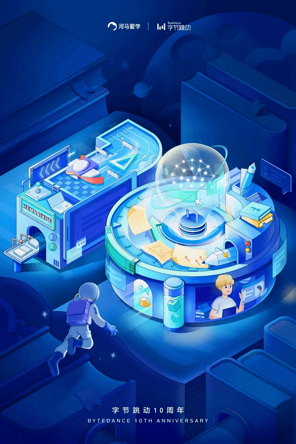
Independent subject composition means that there is a clear subject in the picture and only one, and this as the core vision, all other elements as auxiliary.

Symbolic composition is the concentration of the main elements of the picture within a visual symbol.
02.spaciousness
Many images give a very flat feeling, usually because the composition has no sense of space, there is a sense of space will be more three-dimensional picture, or so that the flat poster has a feeling of transcendence of the plane, so in the visual impact and the sense of quality will also be enhanced.
To make the picture very spacious, you can work on the following aspects:
Composition in thirds
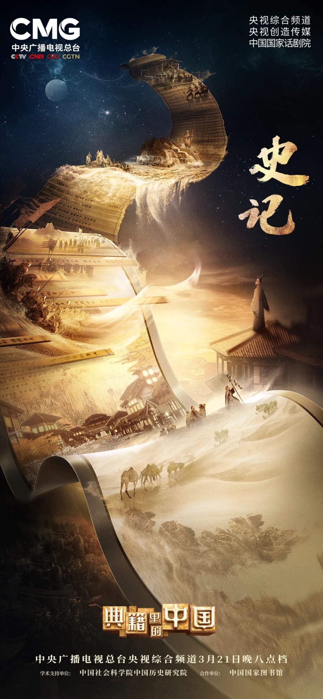
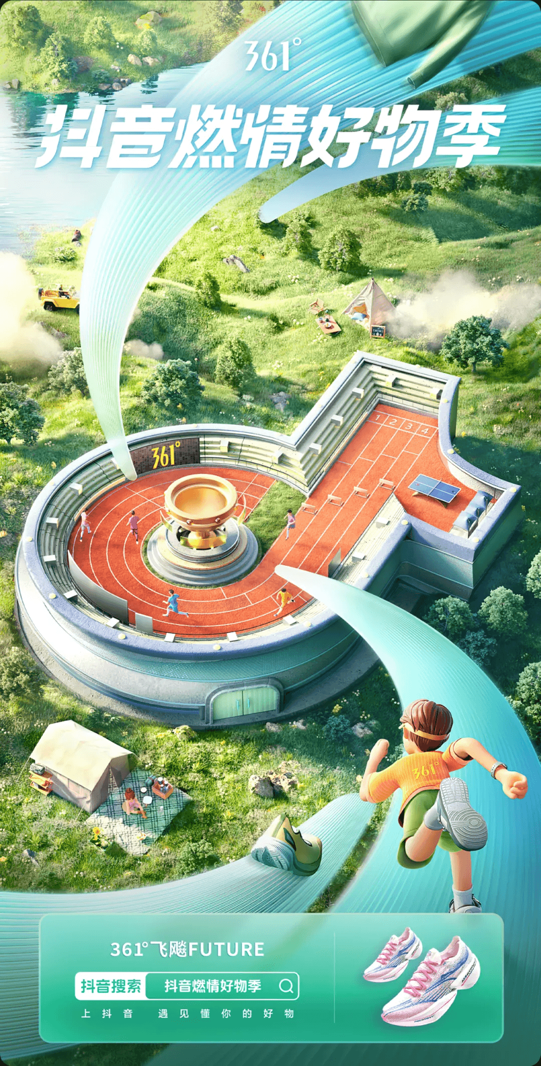
It means that the elements in the picture are distributed according to close, medium and distant views. For example, in the picture below, the nut gift box at the bottom is the close view, the squirrel IP and the sailboat are the medium view, and the flying balloons and the sky at the back are the distant view.

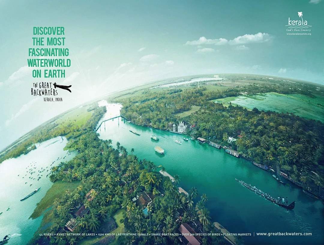
Composition using strong perspective
With a strong perspective, the image will appear three-dimensional and spatial, such as a large elevation angle, bird’s eye view composition, fisheye lens, etc., which are easy to shape a strong sense of space.

Lighting details follow the principles of perspective
Each scene type of screen should have a main light source, then the change of light and shadow need to follow: near the light source bright, far from the light source dark; clarity and color will also change, the farther away from the line of sight the more fuzzy, the nearer the clearer, of course, this is in the absence of a depth of field effect; the color according to the spatial relationship between the different The color will also change, the farther away the color purity is lower, the closer the color purity is higher.

Under the depth of field effect, the position of focus is the clearest, the further away from the focus position will be more blurred, the depth of field effect can also strengthen the sense of space in the picture, which is conducive to weakening the secondary elements and highlighting the main body.
03.sportiness
Dynamic images have more visual impact, but also more lively and fresh, when the creativity and composition of the form is not colorful, I will try to add dynamics in the composition, in order to try to make the picture less conventional. So, how to compose a picture to make it more dynamic?
Letting elements hang in the air
Unless there is a specific requirement, you don’t even need to go too far for realism, let the elements in the picture fly and the sense of movement comes naturally.

Exaggerated perspective
The more exaggerated the perspective, the greater the visual impact and dynamism, ideal for sporty types of design.

Large character dynamics
Want the picture to have a sense of movement, then the characters in the picture try not to just stand straight or sit steadily, let TA run up, jump up, fly up the effect is better.

Dynamic composition
For example, diffuse compositions, spiral compositions, and curved compositions are more dynamic.


04.tensile
Tension this word should be a lot of designers have heard but may not understand, we can literally understand, Zhang, that is, open, open, meaning that the composition should try to open some, in other words, the composition should be full, to the atmosphere. For example, the following two posters, the same is the use of symbolic composition, the first picture of the main elements of the picture are concentrated in the graphic symbols, the composition is not full, so the tension is not enough; the second picture is the entire layout space as a scene, the visual symbols are just fused inside, so the composition is very full, more tension.

05.concluding remarks
Composition may seem to influence the picture of the big effect of a factor, but to be a good composition, in fact, there are a lot of details need to be carried out in place, but also a test of art skills, when your design in the composition on the freshness to others, I believe your design must not be too bad, so it is worthwhile for designers to spend more time on the composition of the study and research, I hope that this article is a little bit of help for everyone to do the design.