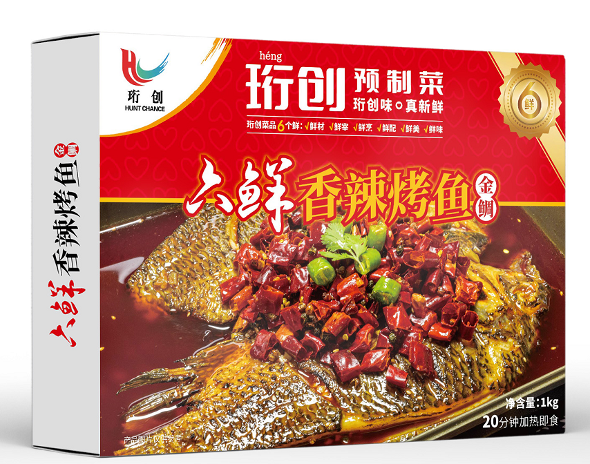
Recently, Honed Prepared Dishes planned to enter the e-commerce platform and needed to plan and design a page. This page is from the brand presentation padding to sell goods on the ground, once molding, once completed. Equivalently, a new brand, from planning to face consumers, all completed. A web page, an e-commerce page, an introductory link to convince customers to buy, or any other page, is pretty much the same principle.
一、Definition and value of commodities
Improve the conversion rate of the entrance, it can stimulate the customer’s desire to consume, establish a sense of trust, dispel the customer’s consumption doubts, prompting the customer to order, and at the same time can convey the corporate brand information, to complete the flow from the traffic to the effective flow and then to the loyal flow of a transformation.
二、The necessary parts of the detail page are divided into five categories
- Product display category: color, details, advantages, selling points, packaging, and matching effects.
- Attracting purchases: Touching selling points, emotional impact, buyer reviews, and hot selling events.
- Promotion instructions: Hot selling products, matching products, promotional products, and discount methods.
- Strength display category: brand, honor, qualification, sales volume, production, and warehousing.
- Transaction description: Purchase, payment, receipt, inspection, return, exchange, warranty.
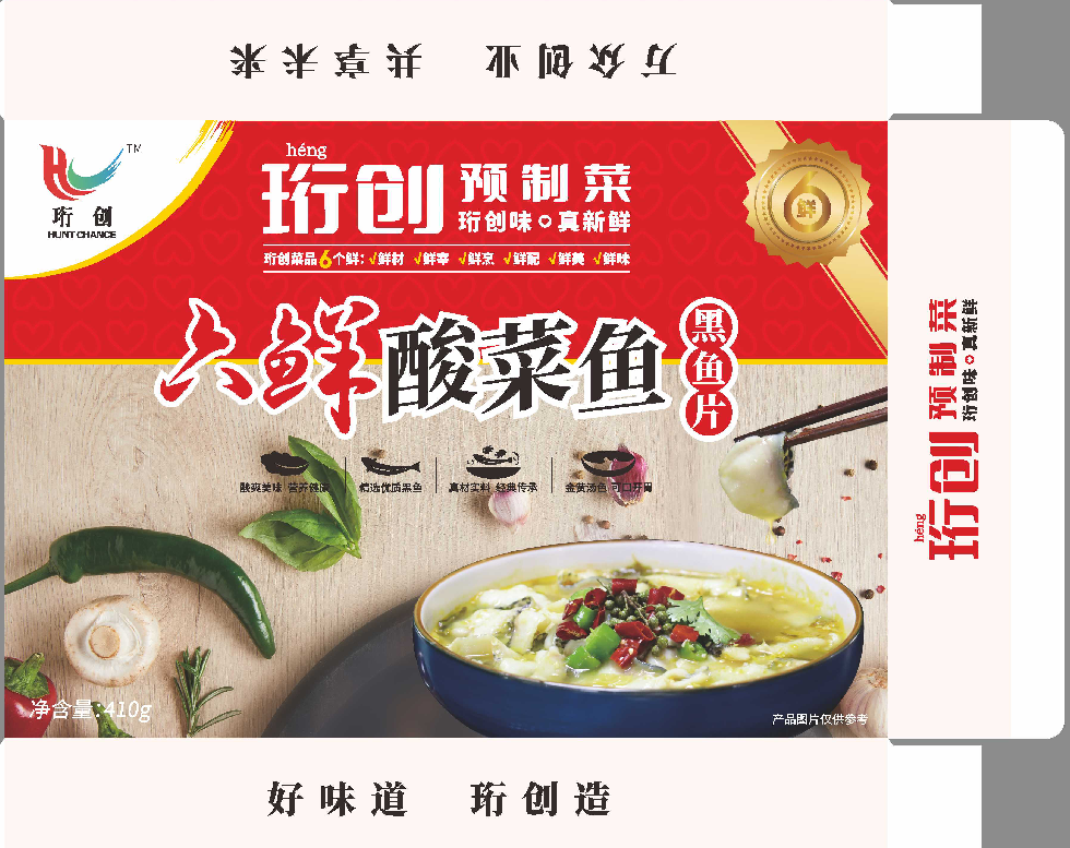
By relying on these five categories, I can effectively showcase everything on the product detail page, shaping the unique attributes of the product and achieving a product conversion effect.
So once we understand the necessary parts of the product details page, let’s explain in detail from which aspects the product description should be viewed.
三、The description on the details page should follow the following five senses
- Realism: Realistic reproduction of the product’s original appearance from different angles.
- Sense of logic: Deploy and expand the display of purchase points according to buyer needs, achieving layer by layer attraction and achieving purchase.
- Intimacy: Set the style of copy and images based on the characteristics of the target consumer, which is friendly and close.
- Dialogue sense: In the sales process of online stores, product introductions are completed through text and image descriptions. As a virtual salesperson, the description should have a sense of dialogue and be carried out using dialogue logic.
- Atmosphere: Creating a sales atmosphere in a product is just as important as in a physical store, creating an atmosphere where many people make purchases and allowing buyers to make decisions based on herd mentality.
Summary: Before designing product detail pages, it is necessary to conduct thorough market research and industry research to avoid similar products. At the same time, it is also necessary to conduct consumer surveys, analyze consumer groups, analyze consumer purchasing power, preferences, and issues that customers are concerned about when making purchases.
For example, if we plan to create a page for merchants to create pre made dishes, we will search for the style of pre made dishes in the industry as a way to understand, learn about peers, and understand the effects of other brands as a source of information. So everyone knows that the product details page is designed to give consumers a better view of the product. Merchants will introduce the product on this page, and consumers can understand the content of the product by viewing the details page, and then decide whether to make a purchase. So, what information does the product details page include?
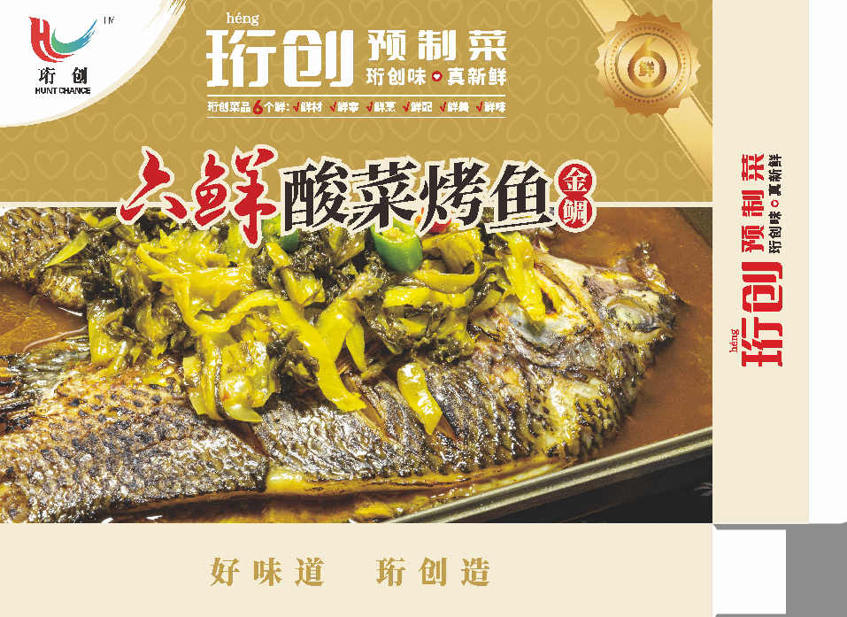
四、What information does the product detail page include
1、First screen poster
The first screen poster can be set with store marketing images to place the store’s main promotional items here. Because it is at the front, it can be seen at first glance when the buyer clicks to enter.
Whether it’s people or anything, first impressions are particularly important. So the first screen poster should have its own distinct highlights.
2、Scene diagram
A scene picture is a model with a background, and this picture is a scene picture. The scene picture can be integrated into the environment, and it has a strong sense of immersion. Only when customers have a sense of immersion can they have a strong desire to shop.
3、Selling point chart
The selling point diagram is the product advantage. When choosing to make a product, the first step is to understand the product’s advantages, and then reflect the advantages on the selling point diagram. Because it is not expressed intuitively in this way, buyers cannot understand the advantages of the product, and therefore will not make a purchase.
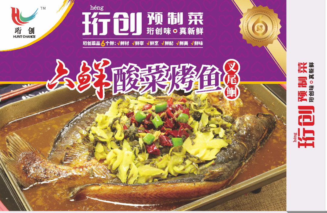
4、Product Specification Size Chart
The product specifications and size chart are also very important. After all, most buyers nowadays shop silently and prefer to buy their own.
He doesn’t talk to you much, he just looks at your details. If he sees it well, he will buy it and put the size chart on it for the buyer to easily check.
5、 What issues should be noted on the product details page
If it is a product in the clothing category, it is best to have detailed page images that showcase the advantages from various aspects, but the corresponding number should not exceed 20.
After all, having too many images can actually increase consumer aesthetic fatigue, which is not conducive to the transformation and improvement of the store. Then, before and after the production of the details page, it is important for merchants to carefully consider how to make it. It is necessary to conduct sufficient research on all aspects of the product, with the aim of better avoiding the same product, analyzing customer habits, preferences, and identifying pain points. The preparation work is for consumers
A systematic analysis was conducted to identify the strengths, weaknesses, and unique selling points of the product. Therefore, businesses should not overlook some small details when creating detail pages, because sometimes consumers may not be familiar with the product and can find answers in the details page. Therefore, it is best to introduce the details on the detail page in more detail, and it is best to include a few pictures, which will be better.
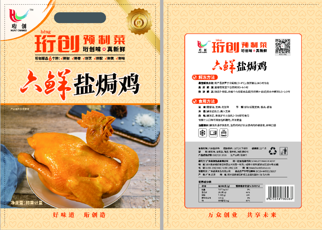
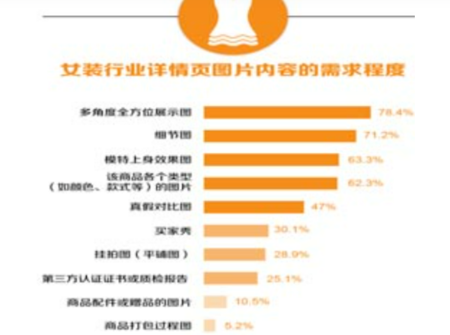
6、the customer on the details of the page content are some of what requirements
What are they concerned about the content of the details page? What is their psychological process of shopping?
I give an example to clothing, digital for example:
(1) the first impression, this baby (style, style, etc.) whether to like?
Focus: the overall display (posing, modeling).
2) Look closely, the quality of this baby is good? (function is not complete)?
Focus: detail display, function display, brand display.
(3) Is this baby suitable for me? Focus: function display, size specification.
(4) whether the actual situation of the baby and the seller introduced to match (whether genuine?). Is there any color difference? Is the size deviation)?
Focus: baby brand, baby sales, buyer comments.
(5) want to buy the baby baby price is not favorable?
Focus: activity promotion information (discount, full reduction, combination price, member price), preferential information (whether free shipping, cou
In a fast-paced life, users do not have the patience to read lengthy images and text. Therefore, good page copywriting is concise and concise, allowing users to quickly understand the product situation they want to know.
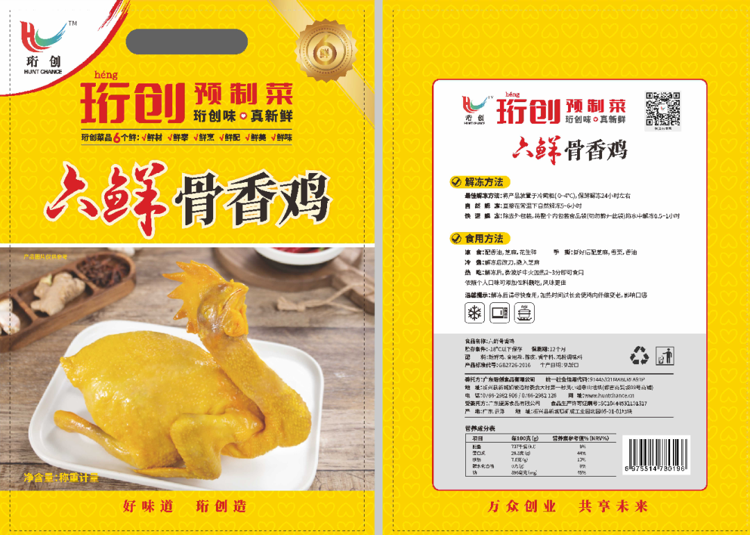
7、 Design concept for a product detail page
The four design sections of the detail page
Product section: includes product attributes such as product images, purchase instructions, specification selection, price discounts, etc.
Evaluation section: Communicate more information about the product to users, such as user reviews of used products, how to use them, after-sales service, and other emotional introductions, in order to answer user psychological questions and concerns.
The graphic and text details section: With appropriate length, after categorizing the key points of user needs and the selling points of the product into important levels, make the first half of the page information in the graphic and text details section prominent.
Recommendation section: Recommend similar products or other products that match the products on this page, providing users with more choices.
Five basic functional modules on the details page
Design customer service, bookmark, share, store, and handle immediately. Emphasis should be placed on human-machine interaction, making these tools easily visible to users, enabling them to engage in high-frequency interactive operations based on the scene anytime and anywhere, and achieving more effective user conversion. By analyzing the theme scenarios of user product interaction, the value of interaction scenarios can be prioritized.
Buy Now: Users will be able to directly enter the purchase confirmation page.
Collection: Users can save their products in their personal center, and in a future scenario, they may make purchases.
Customer service: Users can answer any questions during the selection and purchase process through manual intervention.
Store: Users can directly enter the store to learn and choose more products.
Sharing: As a type of user who has the most direct understanding of the product, the value of actively sharing is much higher than the deliberate sharing process achieved through marketing methods.
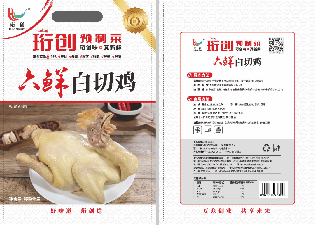
3、Requirements for section design style
The entire layout should have a clear, concise, and clear theme, introducing the product’s selling points to users with beautiful visuals, thereby attracting the attention of users in need. The page style is concise and lively, striving to achieve simple tables, coordinated color matching, humanized text processing, and a sense of familiarity.
- Head image: The ultimate goal of the page is to sell products. Overemphasizing the beauty of the image, increasing the proportion of visual images, and emphasizing the artistry of website design may not achieve good results. The page should be clear and not overwhelming, leaving a deep impression on viewers.
- Title: Clearly and reasonably express the content of the product, highlighting its core value. The title has a clear meaning and no garbled or impurities.
- Sales volume: Sales volume to a certain extent indicates the popularity of the product. Sales volume can be selected from monthly, quarterly, or annual sales, allowing users to know the popularity of the product through sales volume.
- Promotion: By offering price discounts and bundled discounts, users are further motivated to purchase, satisfying the mentality of “saving” or “making money by buying”, and providing information such as promotional activities and coupon discounts.
- Evaluation: Extracting positive keywords for top display, ranking objective positive content before the evaluation or intentionally displaying positive interactive content. Introducing products through user evaluation content is more convincing and can better reflect that the product meets the real needs of users.
- Image and text: images and matching textual discourse. Images leave a deep impression on people and have a stronger emotional perception compared to text. But if we only focus on the images and ignore the copy that matches them, we cannot achieve the expected goal. Because the product’s attributes, selling points, and catering to the emotional needs of users all require copywriting to explain and elaborate.
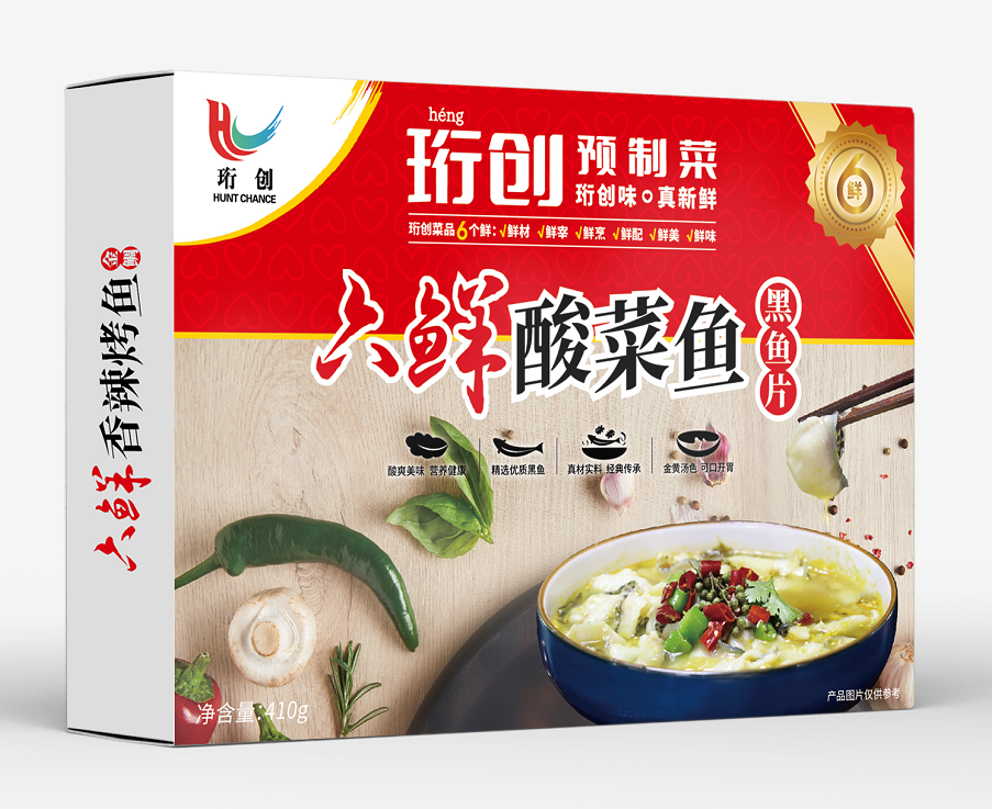
八、Cleverly Using FABE Rule
The FABE rule is a very practical marketing rule, and through the flexible application of FABE, we can use it to guide the design of detail pages in order to achieve good marketing results.
FABE is a very specific, highly effective, and highly actionable profit promotion method. By using the FABE rule to guide the design of detail pages, a large framework can be constructed, providing a smooth and reasonable design logic, thereby enhancing the visual appeal of detail pages. Cleverly utilizing it can increase your product conversion rate.
- Features: The basic characteristics of a product. For example: product name, place of origin, material and process, etc.
- Advantages: The uniqueness of the product. For example: larger, thicker, more upscale, etc.
- Benefits: What benefits can it bring to consumers. For example: comfortable, energy-saving, etc.
- Evidence: including technical reports, customer letters, newspaper articles, photos, demonstrations, etc.
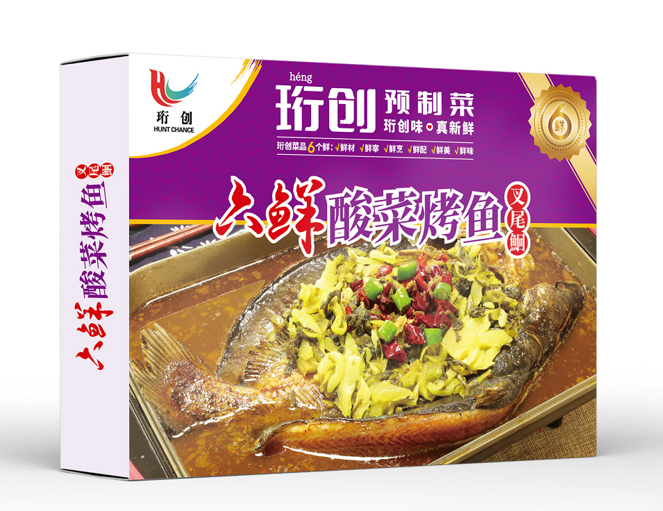
九、What are the characteristics of a good detail page design
1、Simple and clear
To put it simply, the function of the details page is to inform customers why they bought this product and how it works after purchase. Any copy or image is actually created for these two purposes. If you make the details page too complex, without any order or logic, just a pile of images, the conversion of such details pages will naturally not be high.
2、Clear selling points
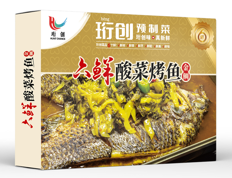
Many people may have a misconception that recognizing images is enough as long as they are beautiful enough. People have an appreciation for beautiful things, but if this kind of beauty can only be appreciated by customers and cannot impress them to make purchases, then your pictures will also fail. The pictures on the details page should emphasize beauty and showcase the product’s selling points well. Customers will not pay for beautiful pictures, only for selling points.
3、Promotional posters
Adding activity posters to the details page is beneficial for customers to have a clear understanding of recent event content when they enter our details page.
4、Affiliate Marketing
Related marketing is generally placed below the poster, and it is set up to provide customers with more product choices. However, the products sold through related marketing must be related to the product itself on our product details page.
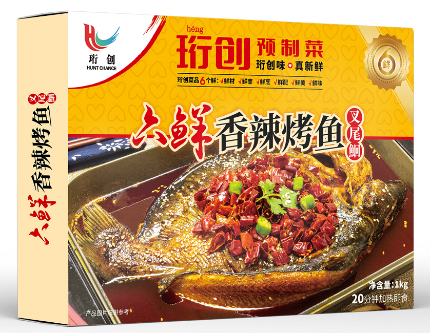
5、Product creative poster
This part is mainly to catch the attention of customers and showcase our products in a more exquisite poster form in front of them. Usually, this section of the poster image is the full product image, which means that the product’s form and highlights can be displayed in this section of the content.
6、Product attributes
Product functions, specifications, weight, ingredients, materials, and other product information. Product attributes are usually displayed in the form of text and tables, and sellers usually put product information in advance under the product’s entrepreneurship poster.
7、Comparison Chart
There are comparisons between new and old products, as well as comparisons with competitors. The purpose is to further highlight the unique advantages of the product compared to other products. The comparison image does not require actual shooting and can be directly searched for relevant materials from the network for production, achieving the purpose of comparison.
8、Buyer Reading
This section mainly displays the logistics content, as well as the product return and exchange process. The main purpose is to inform customers in advance of potential problems and solutions that may arise during shopping, in order to avoid generating a large number of negative reviews due to slow logistics.
summarize
So a good product detail page can improve the conversion rate of user purchases, establish customer trust, dispel consumer doubts, encourage customers to place orders, and at the same time convey brand information and shape the store image. We need to identify the main selling points of the product, establish a clear positioning for the product, tell customers why they want to buy your product, and meet their needs.