The purpose of the album directory is to guide and check, so when designing, pay attention to reflecting the characteristics of eye -catching and easy reading, and have aesthetics.
This article focuses on explaining from three directions:
① Pure text layout
② Picture+text
③ Use of graphics symbols.
The article comes from:【 摆渡鱼生】
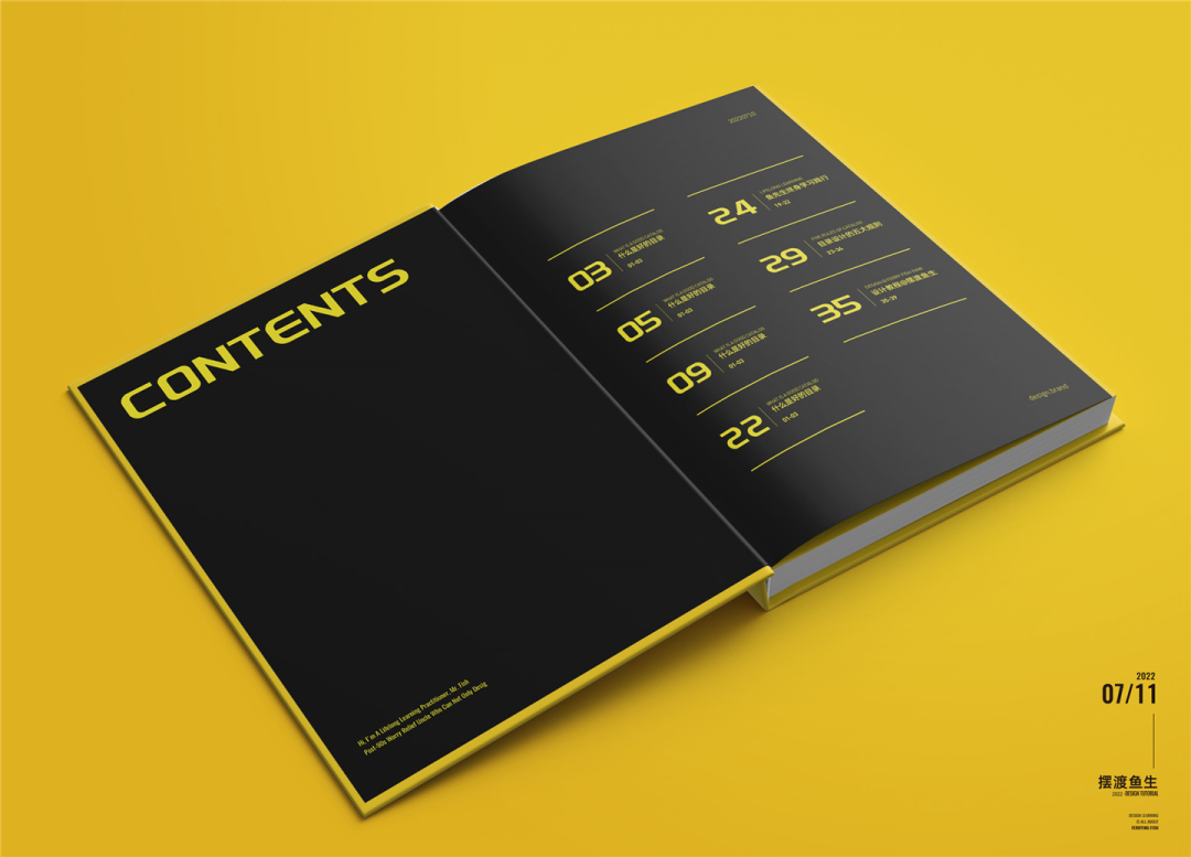
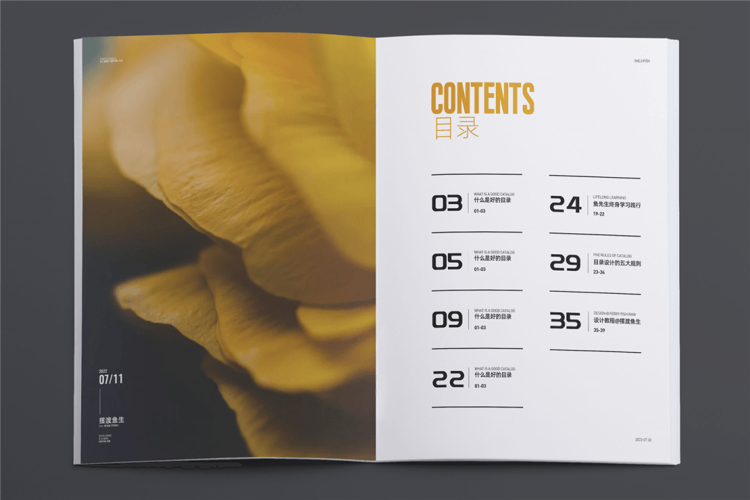
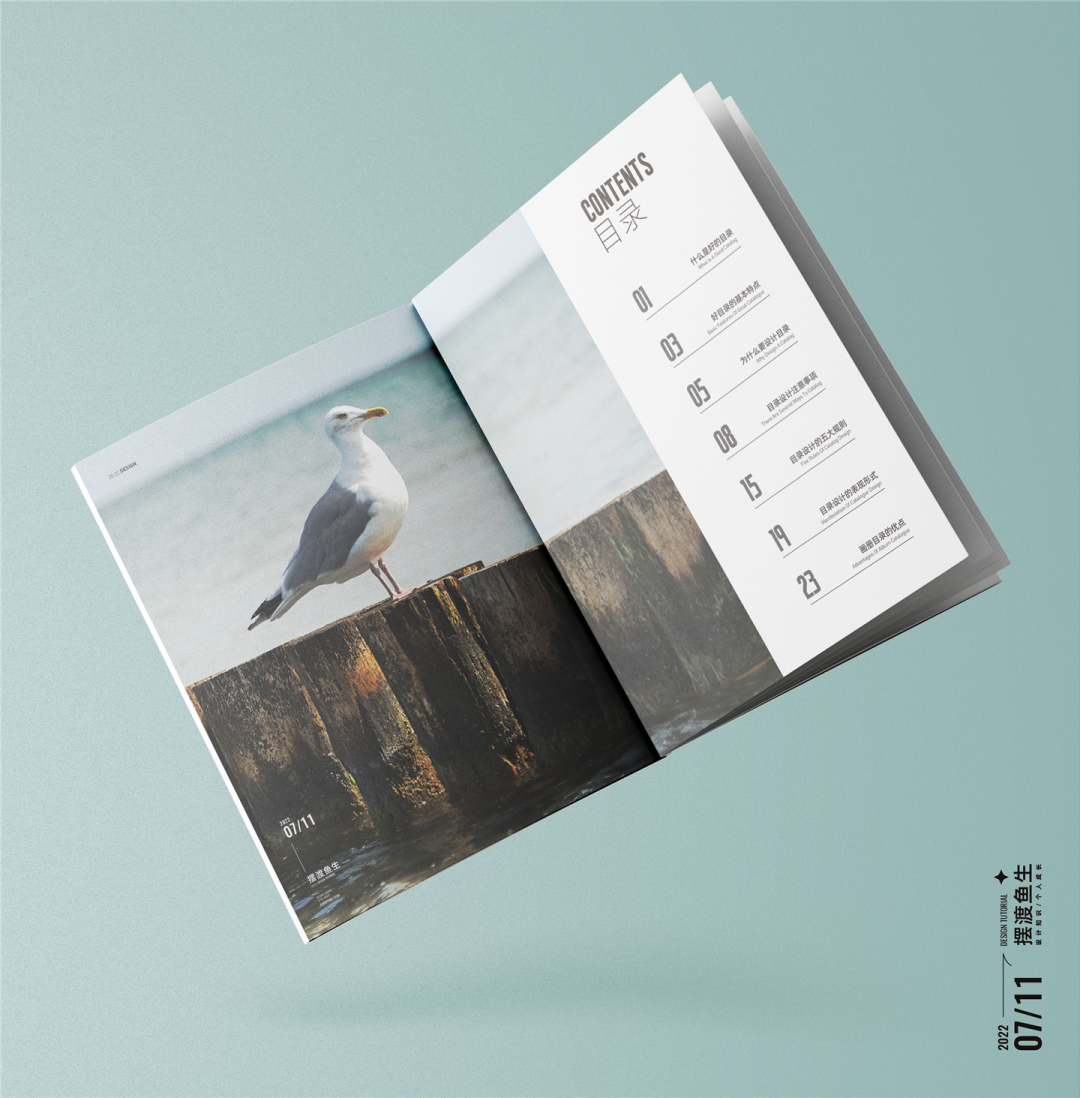
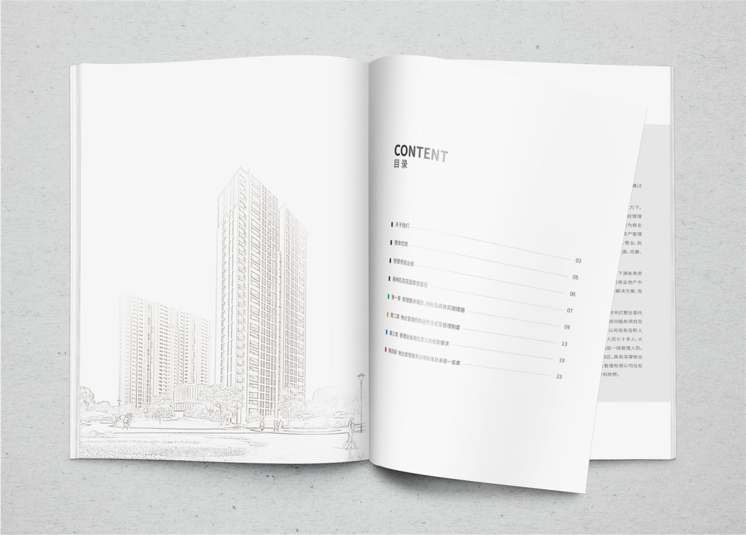
01 Conventional text version
The conventional text version is directly typped with copywriting. The focus is on the distribution of levels and processing the typesetting details.
Example as follows:
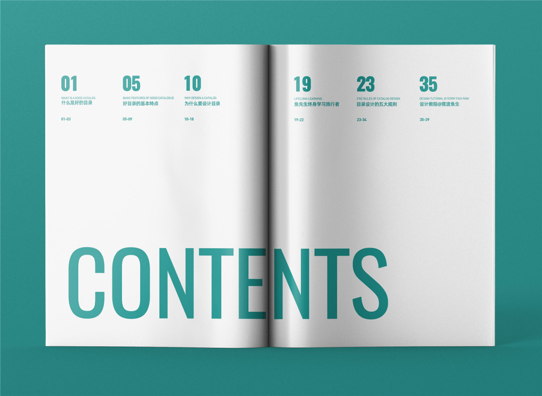
▲ The content of the case is relatively small, the large area is blank, simple and breathable. Pay attention to the balance of the picture during the design process
Let’s try another layout, as shown below:
▲ Leave white on the left, the dictation chapter layout on the right page
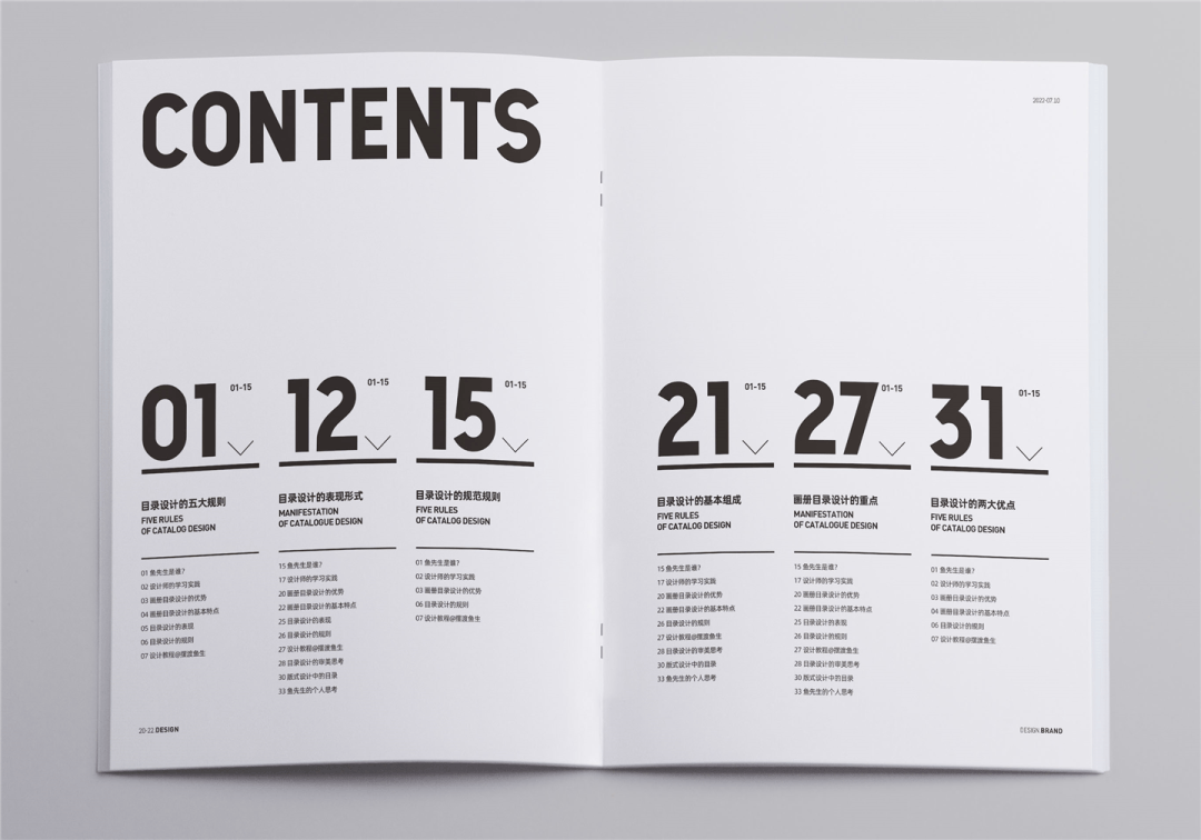
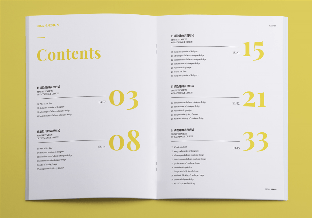
So when the directory information is more information, how will we typeset it?
Example as follows:
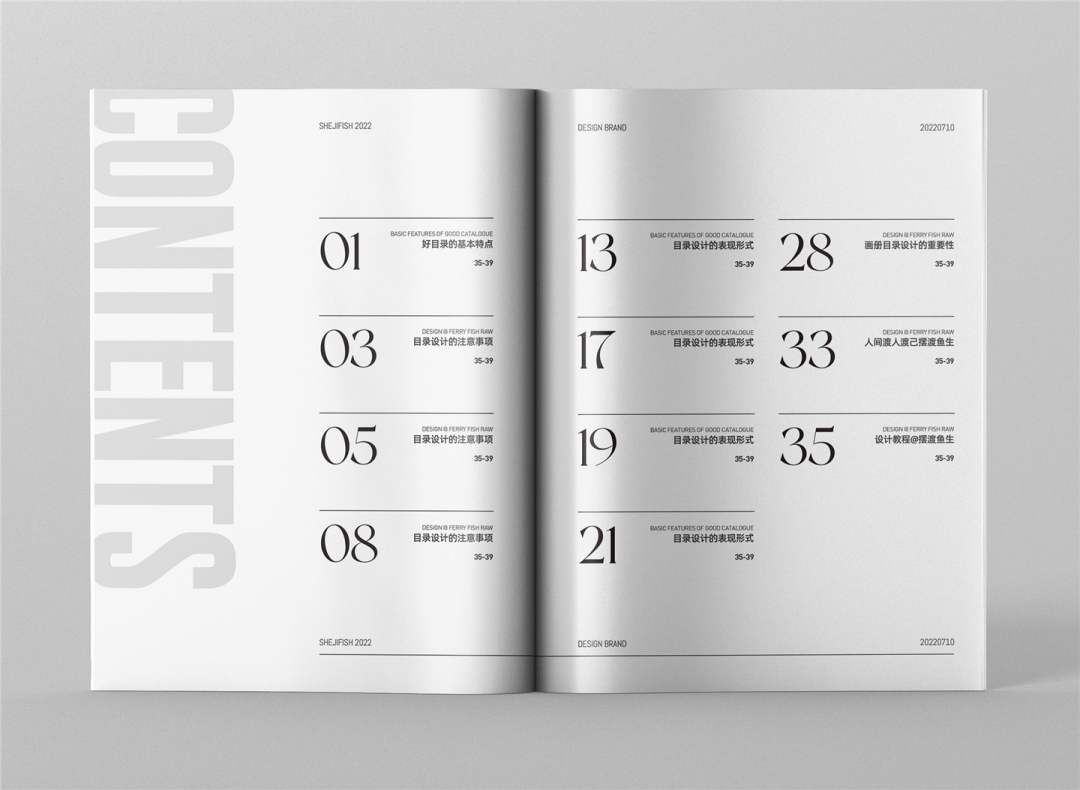
▲ Content sub -column arrangement
Disassemble the column frame that you will not see outside the screen, as shown below:
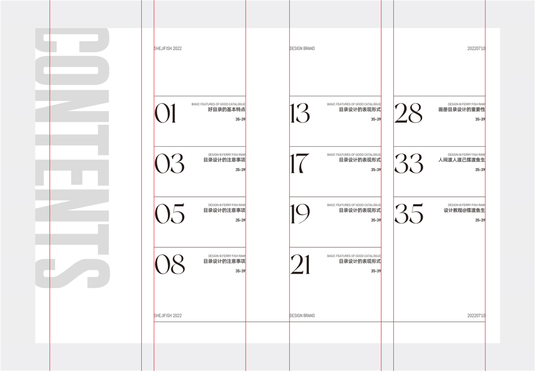
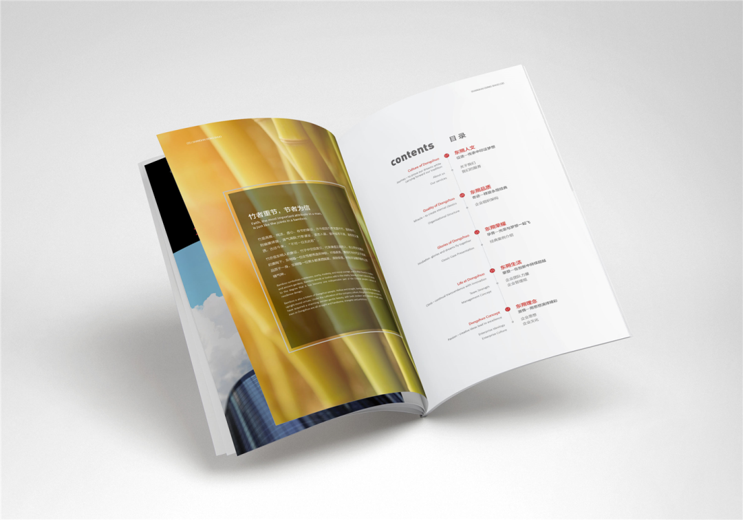
In the conventional two columns, there are four columns in the entire layout. In the first column, Contents are placed, and the directory copywriting is placed in the second, third, and fourth columns.
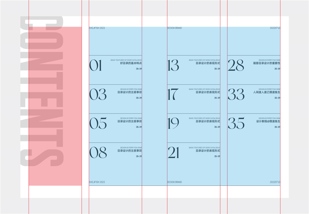
On the whole, there are two major pieces, title+catalog content.
While the column is specified, everyone must also learn to break the situation, such as the processing of English (title) in English. After expansion, it will extend it, let the whole picture break, and have a sense of space extension.
Mr. Yu said:
Pure text typesetting needs to consider blanking and picture balance, as well as the details of text layout.
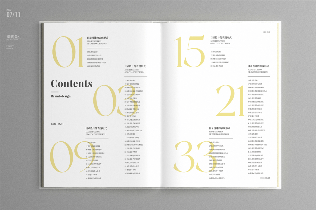
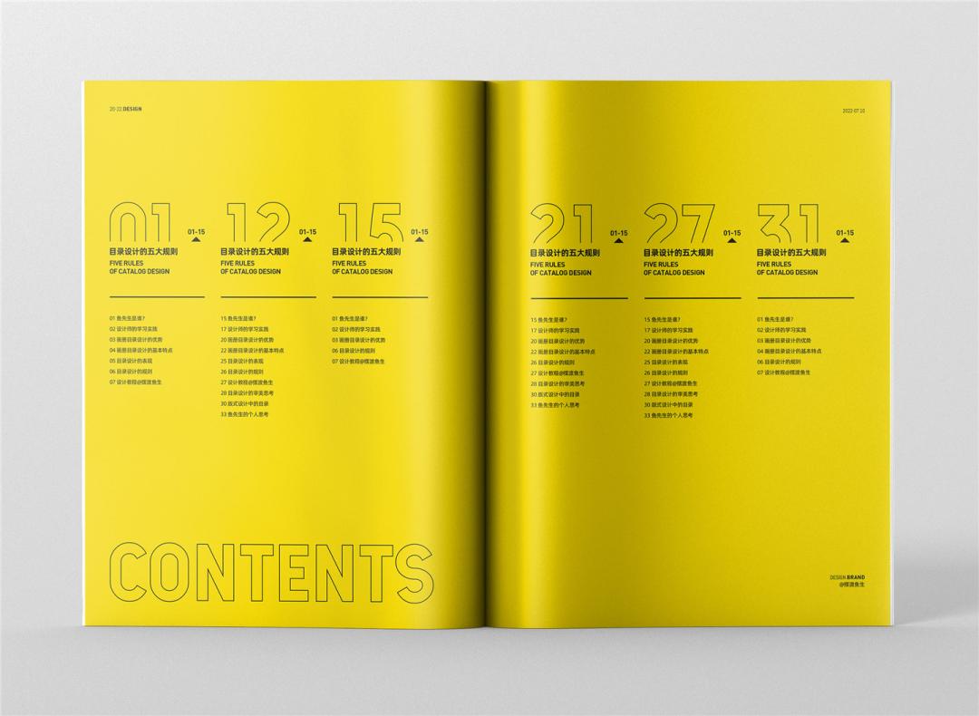
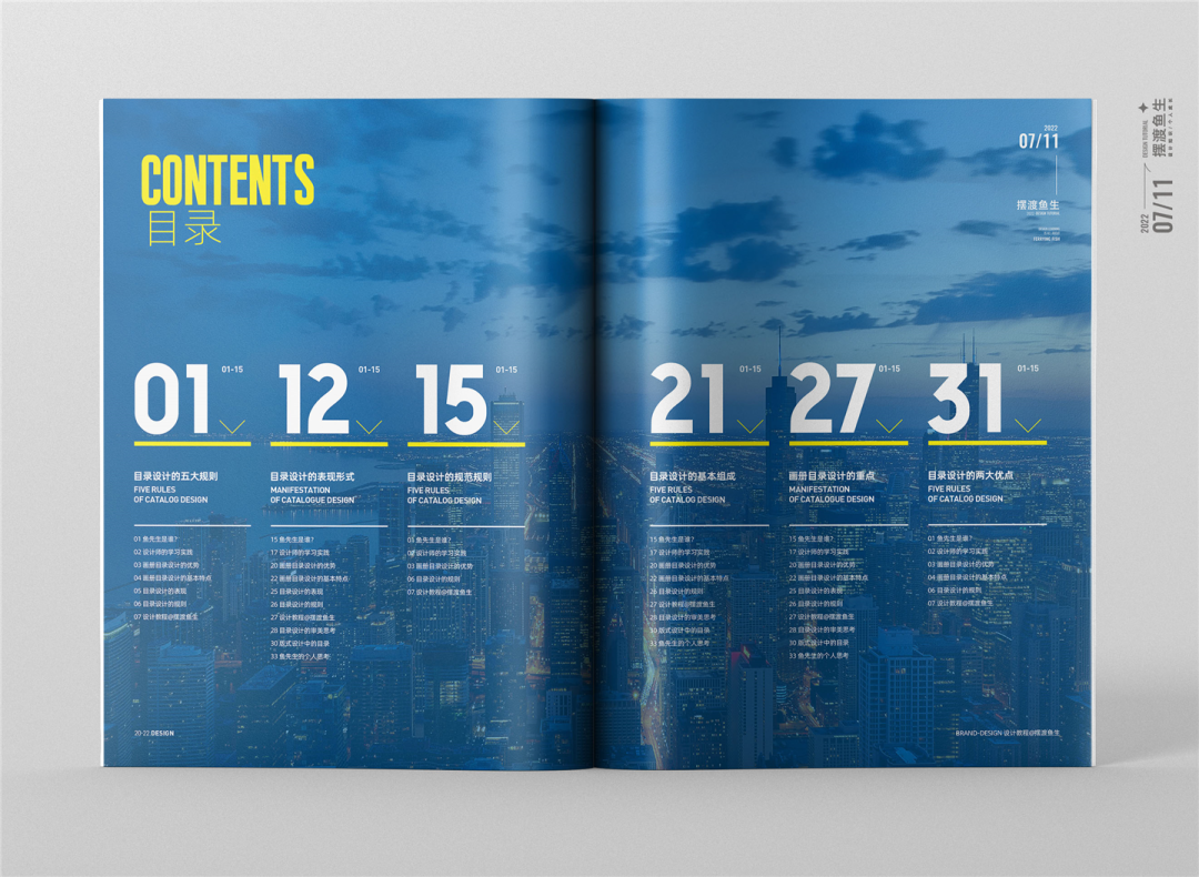
02 Big Dagua
After the number amplification, the number itself will become an attractive visual focus and play a stronger role in guiding.
Let’s take a look at a few cases to deepen understanding:
Remember: The magnification of numbers is not blind. It is necessary to combine business purposes and visual aesthetics.
This seemingly simple layout focuses on the level control and typesetting details of the level of copywriting information.
For example, we select a module in the pattern example to analyze, as shown in the figure below:
▲ Customers provide comparison charts with design
The focus of design ability is to absorb in the process.
Many friends feel very simple to see the picture, but it is not exquisite how to design it when you do it. The problem is that you do n’t know how to understand the foundation form of the design works.

▲ Design formed disassembly details
As the above disassembly, the content provided by the customer is the title+directory text, and in the process of designing, I will add some prompt symbols or auxiliary decorative elements.
Between the number of starting page) and the number of interval pages (31-35), the number of interval pages has included the number of starting page. Due to the needs of the picture, the number of starting page is enlarged separately.
Do not add an element without connection. All the auxiliary elements must make the picture more beautiful, or it can be added on the basis of emphasizing business demands.
We can also emphasize the numbers with embellishment, and it will look more eye -catching, as in the following case:
Is the number above not big enough?
The courage is bigger, we continue to zoom in.
Example as follows:
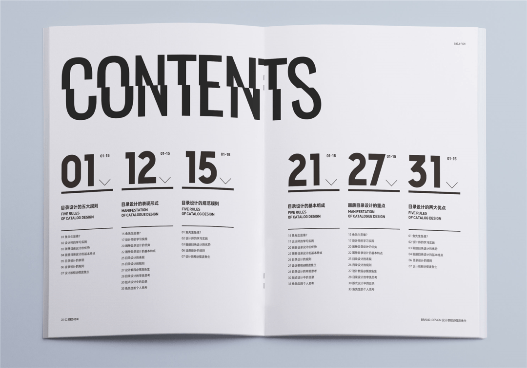
We see the relationship between the numbers and text in the picture, and some are closely followed, and some are pressed on the numbers.
01 The width of the number is narrow, so the copywriting is directly dwelling behind the numbers. Like the 03 piece, if the text is behind 3, then the text will run to the middle line of the album, so we can put it directly, and don’t have a taste.
03 Crossing
Cut the numbers directly, as shown in the following pattern:
Or we try to cut the title, as shown below:
After the segmentation processing, the fun and design of the visual screen is added.
Mr. Yu said:
In the final analysis, the expression of the layout of the design is in the final analysis of the basic expression forms of the plane. This also explains that the importance of the designer’s foundation is firm.
In addition, the processing of division is not only applied to text, the picture segmentation and layout are all possible.
04 icon embellish
The purpose of the icon embellishment is to add icing on the cake. The icon has a certain guidance, but the more important role is to match the layout, make the picture full of changes, and also increase the visual beauty of the picture.
Example as follows:
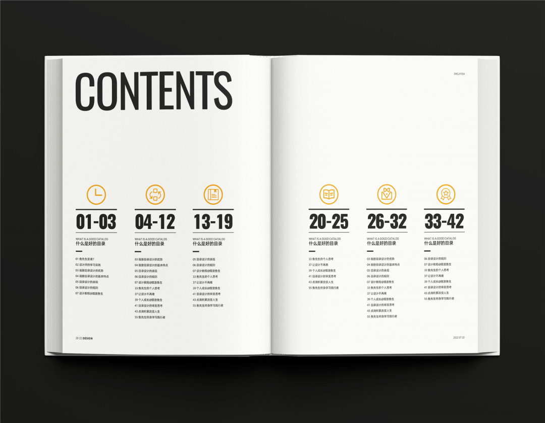
The addition of the icon is not casual, but to be connected with the content. For example, your chapter is about the importance of learning, so you can use the icon of the book. The next chapter is about creativity. You can use it. Bullet and pencil icon.
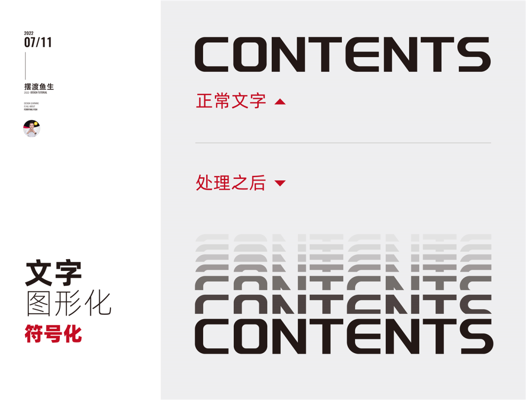
05 symbolization
Symbolization can be text or graphics.
You can directly use the title in the figure, or find an element that is closely related to the enterprise.
Let’s try to handle the title, as shown below:
After completing the typesetting, as shown below:
▲ The text changes slightly to increase the fun of the picture
▲ Eraded the letters, the letter can be the first letter of the title, or it can be extracted from the company logo
▲ Erand the title and form a visual symbol
The above is the symbolic processing of text. Let’s try it again. The graphic symbolization is as shown in the figure below:
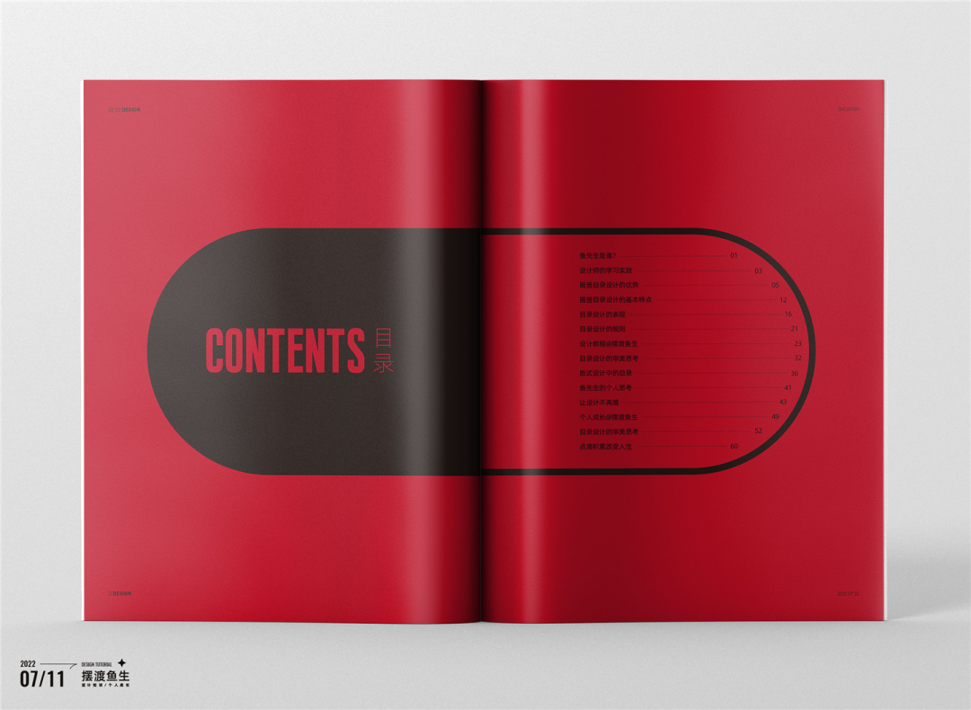
When using graphic symbols, pay attention to: first, the connection between graphics and enterprises; second, the beauty of graphics and easy to recognize; third, you can use common graphics, such as the pill above.
Remember not to pay attention to the beauty, but from the connection of the commercial project itself.
We have designed different layout forms in the above text. Next, we have to start adding picture elements.
06 Rules Picture Application
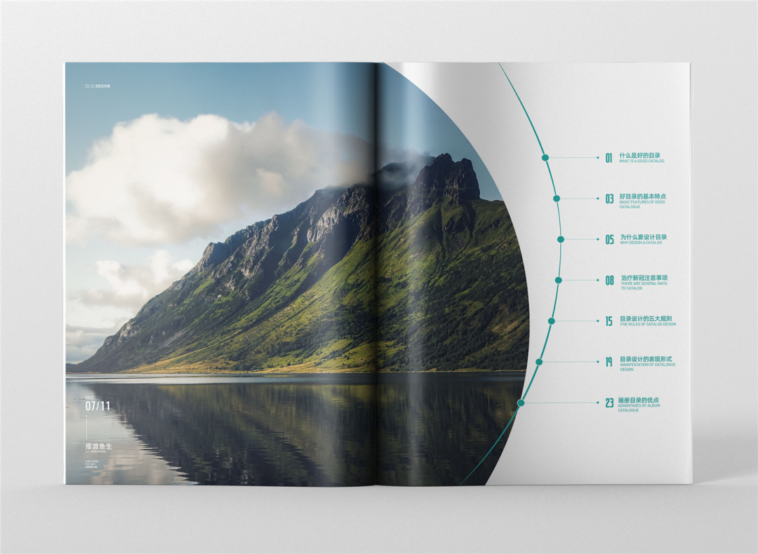
The manifestation of the rules is a square, rectangular, or circular expression.
Let’s observe in the case and deepen their understanding:
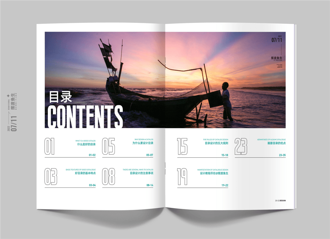
▲ The rectangular picture layout, satisfactory, simple and generous
▲ Mr. Yu’s business design case (construction industry)
Try to other different typesets, as shown below:
Or increase the picture area, as shown below:
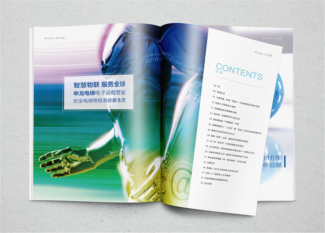
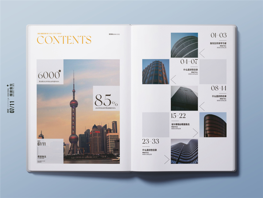
▲ Mr. Yu’s business design case (elevator industry)
Try a few layouts, as shown below:
After joining the picture, the picture is easy to form the first visual focus. Here we should pay attention to the beauty and connection of the picture.
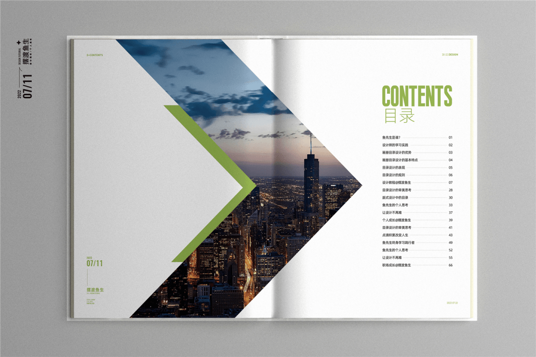
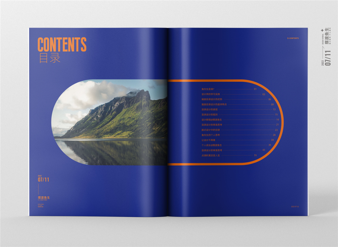
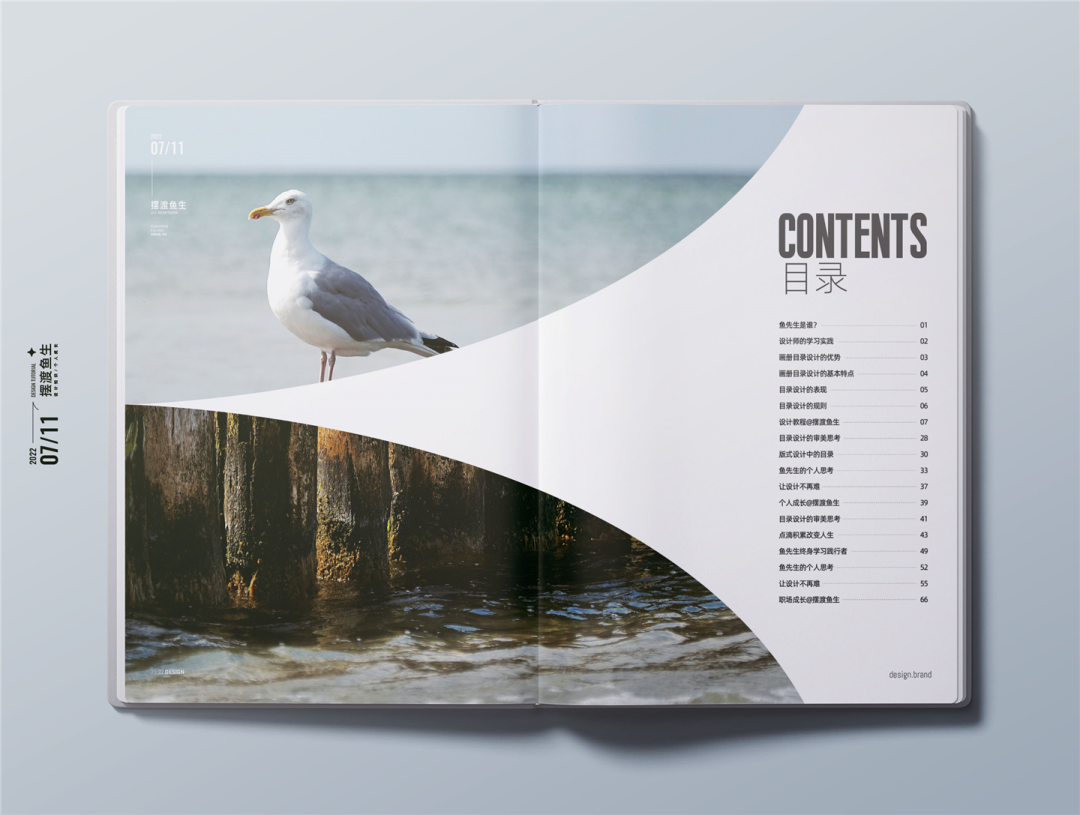
07 Alien Picture Application
The alien shape here is different from the alien in the craft, which refers to the irregular filling of the picture.
Let’s understand in the case:
▲ The picture across the page, add the radian, increase the change of the layout
▲ Use of arrows
▲ Freefill, make up according to the needs of the layout, increase the fullness of the picture
▲ Puppet pill symbol, half of the picture filling, half of the text content, there is a overall and local part
▲ Imitation zipper, divided fill
Mr. Yu said:
Filling with alien frameworks can be a free shape of any freedom, everything is to serve the beauty itself.
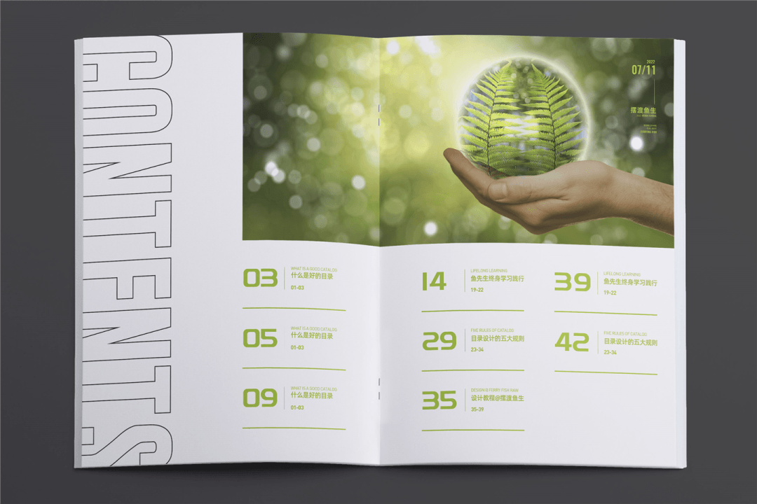
08 full version picture application
Large -area pictures are used as base diagrams to increase saturation.
Pay attention to the sense of space, simplicity of the picture, and the recognition of text information.
The role of the directory is the presence and guidance of the outline of the entire book.
So after choosing a picture, in order to highlight the reading of the text content, I added a blue color block to the picture and adjust the transparency to make it feel looming.
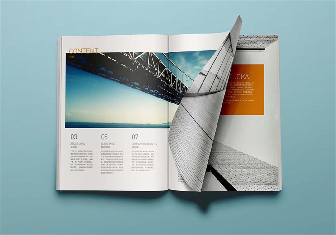
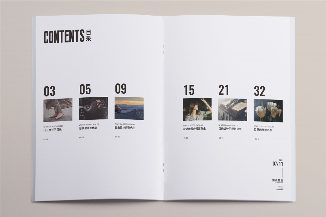
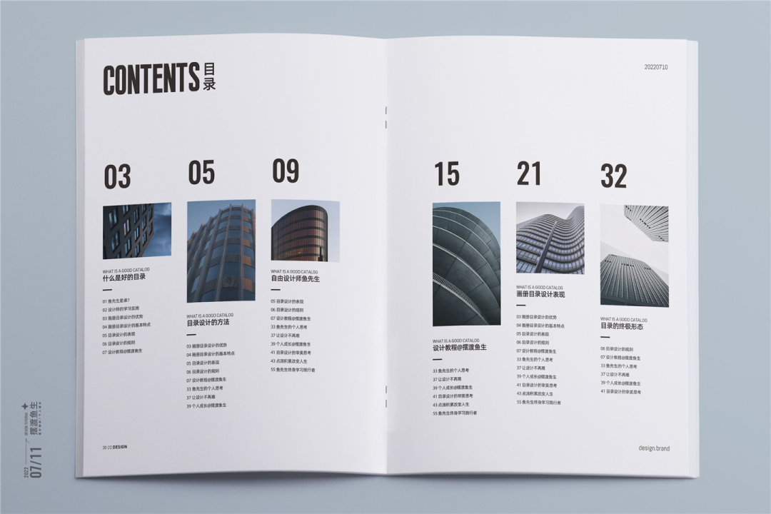
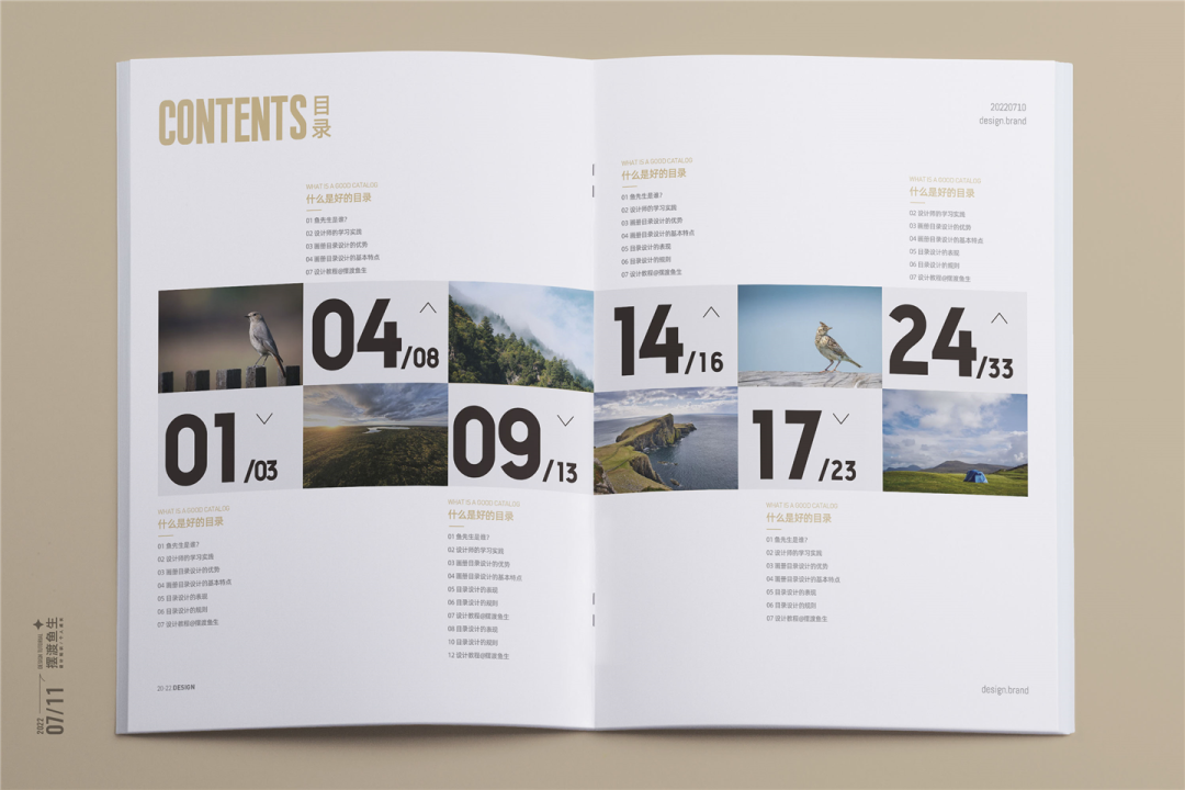
09 combination module
Let the picture and text information become a close friend, exist in the form of a module.
The form of the picture can be ruled or changing.
Let’s learn together and learn:
▲ The picture size is uniform and orderly
▲ Use the ups and downs to make the picture full of rhythm
Look at another actual case:
The modular combination means local unity, but when we design the screen, we must also learn to make the unified change, so as to better highlight the smart and aesthetics of the picture.
10 axis
In the combination of axis as a line, there can be many forms, such as text axis, graphics axis, and picture axis.
① text axis
▲ Mr. Yu Business Design Case (Business Office Industry)
In the above case, the directory is Chinese and English, so I use axis in the form of axis when designing. The English on the left and the Chinese on the right, which increases the aesthetics while not losing reading.
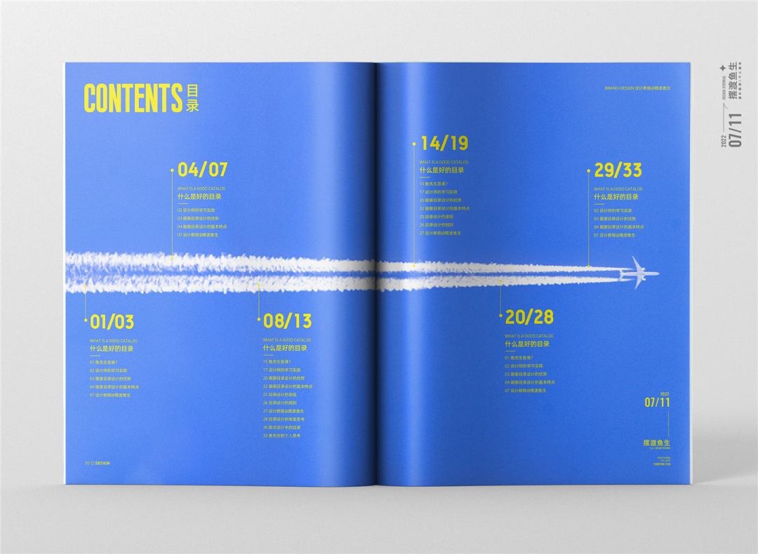
② Graphics axis
The aircraft flew past as axis, and the text content was layout up and down.
For another example, we can use architecture, such as Oriental Pearl, or using vector graphics, wine bottles, batteries and other elements, you can practice more.
③ Image axis
▲ The upper and lower sets of pictures are arranged in the form of axis
11 grid system
Draw the grid, and then fill in the content, as shown below:
After the completion, the case is as follows:
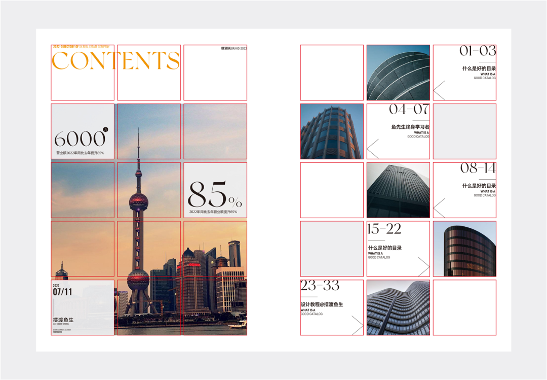
The layout design is inseparable from the grid, and the grid plays a standardized role, but in design, we must also learn to break through the rules.
It sounds a bit contradictory, but in the actual design, if it is planned according to the grid, the picture will appear rigid. The breakthrough rules mentioned here are to properly break the situation, thereby increasing the smart and interesting of the picture.
12 auxiliary graphics
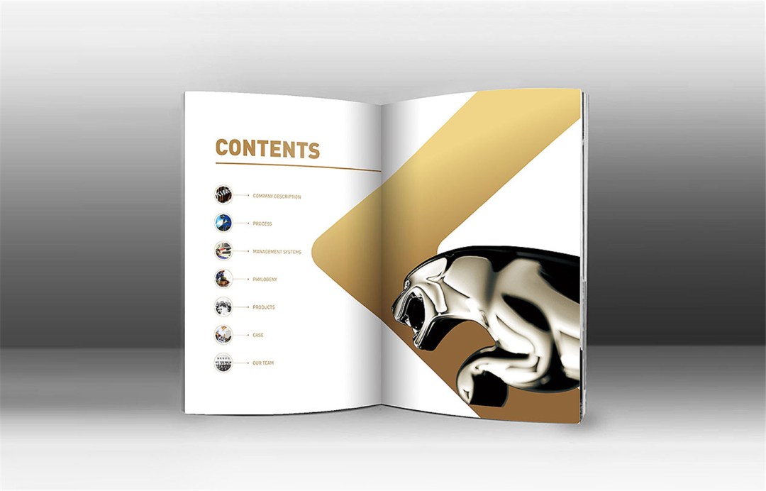
The following pattern is a customer who serves a stainless steel stereo word. It has its logo in the cover. There is an arrow symbol in the K letter in the sign.
Here you can use the symbols in the logo as auxiliary graphics, which are applied in the design of the album. I have seen the cover and directory. I have made auxiliary applications.
And we extract design elements from the logo, and customers will like this design.
The auxiliary graphics itself also exists as a symbol. This is also the meaning of the auxiliary graphic designed. It plays a good role in the extension of the visual screen. Students who understand the brand design must be no stranger to the auxiliary graphics.
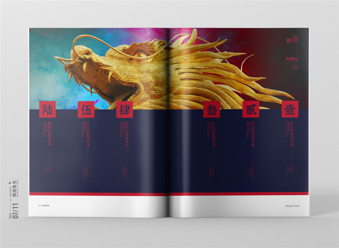
12 vertical layout
The vertical layout is more common in traditional and Chinese industries, but the vertical version does not mean that it must be Chinese.
The vertical layout is also a design of design, as follows of patterns:
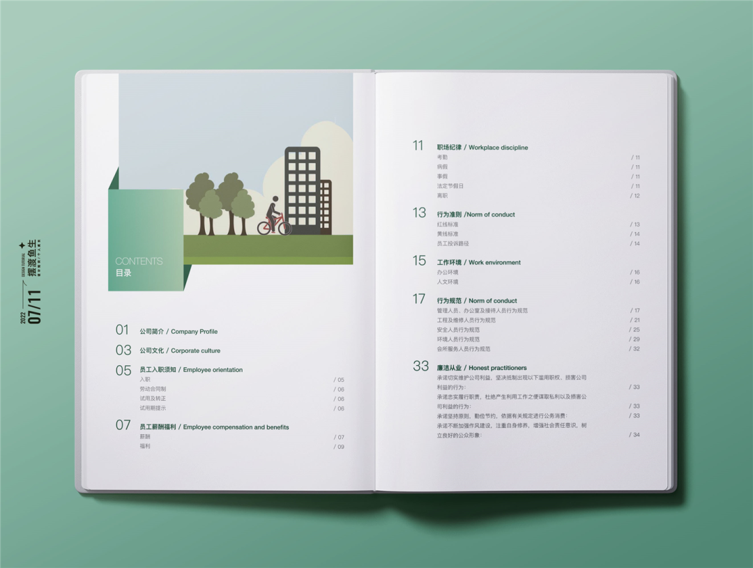
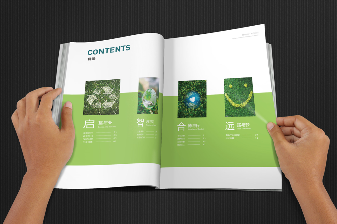
13 color block distinction
The distinction between color blocks here is not to say that gradient color or color, but in the design project, there will be a lot of directory chapters. At this time, we can be divided into chapters through color.
▲ Business design case
The case in the figure above is to distinguish different colors with different chapters.
Let’s look at a more obvious case:
The use of color distinction is that there are too many directory chapters, or there are multiple products in the product album. In order to better distinguish the layout, different colors are used to distinguish. This is a good design form.
Written at the end:
The design is ever -changing. In business design, our design should be based on the business demands that meet the project itself. The content of the directory will not be constant, there are more or less.
Therefore, everyone should not blindly move hard in the design of the specific project, and learn to use these design methods.